Taco Bell
- Design Direction
- Design System
- Campaign
Encore Hours: Taco Bell as a destination, late night as an occasion.
The brief
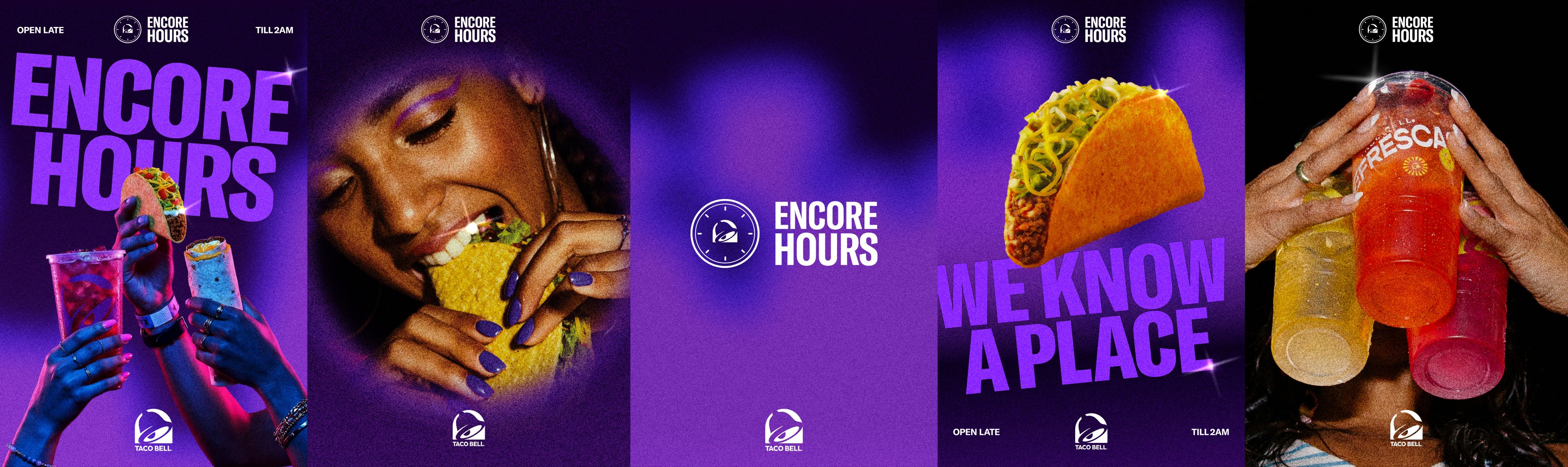
Encore Hours
Less functional, more emotional: a space and a mood Taco Bell has created for its customers. Alter-ego + edge + night mode.
The strategic trifecta
Flavor, vibes, value
Flavor: unconventional food, unconventional energy
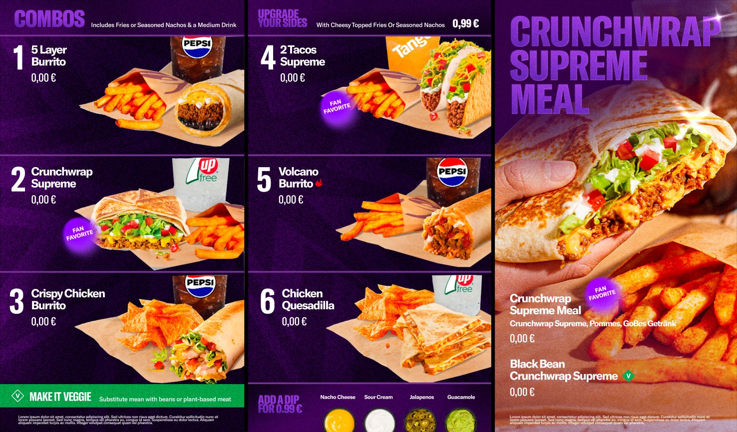
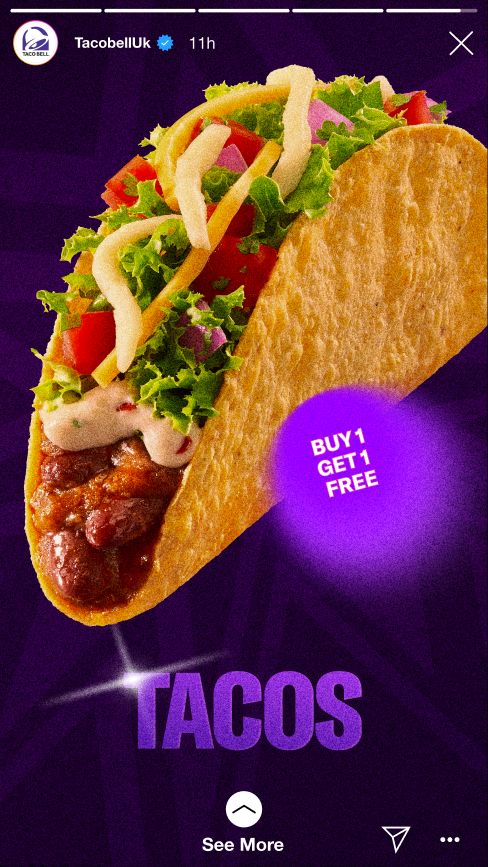
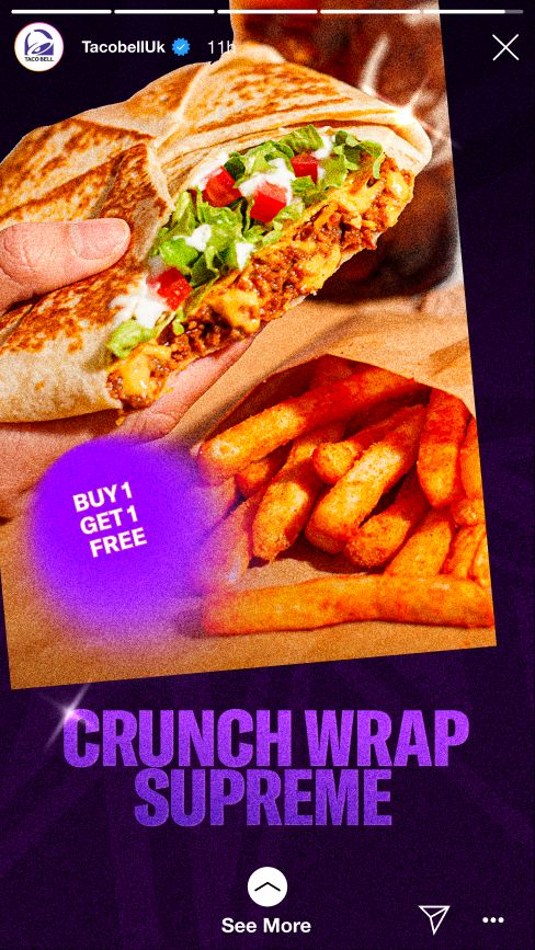
Our photography content speaks to the flavors of our menu items, from solo food photography to lifestyle imagery with food. The sparkle and highlights are used to create focus on the flavor.
Vibes: the ‘feels’ of nightlife, freedom of identity
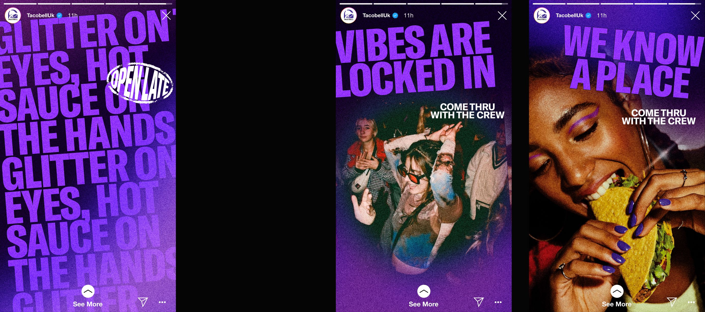
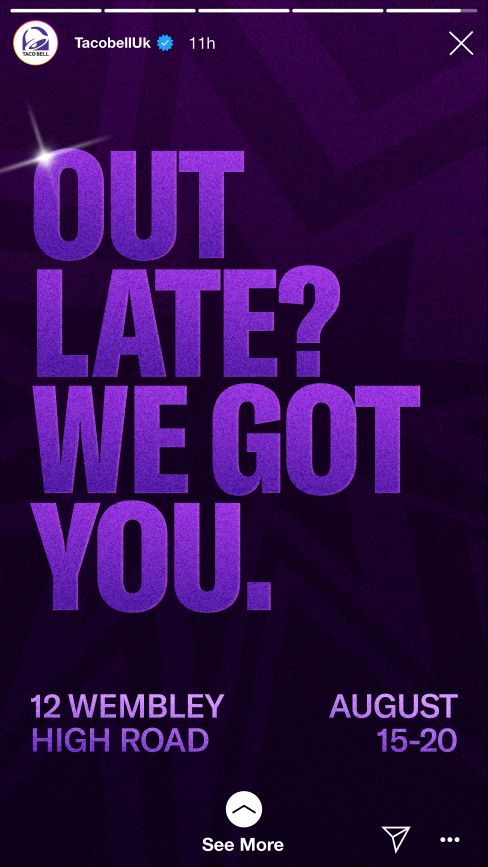
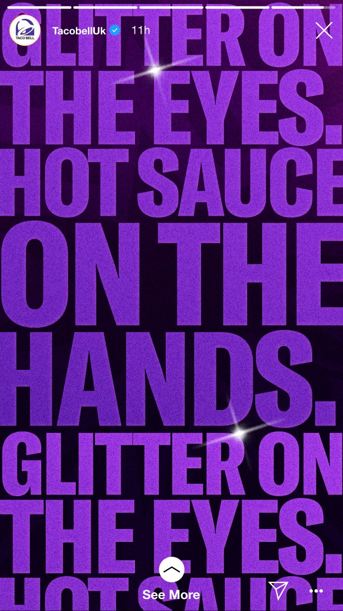
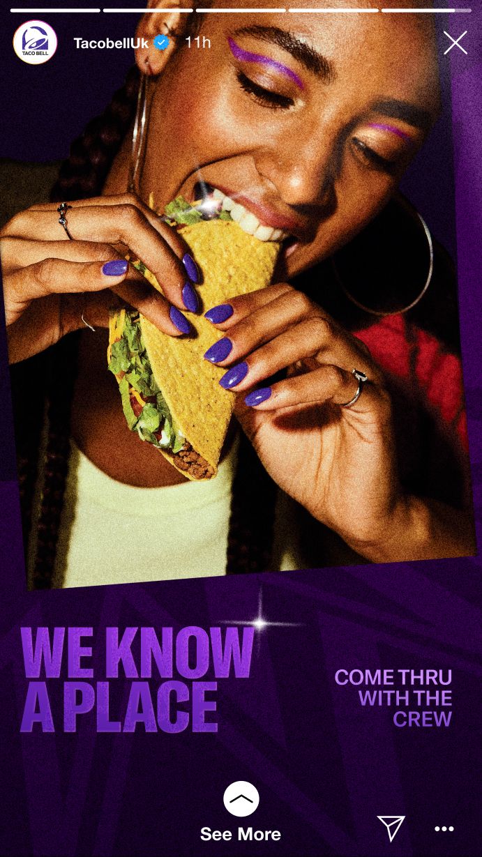
Our flexible design system is grounded in night culture. We use moodier colors, flash photography (which includes the grain and glows), playful lingo, and most importantly the layout and composition to represent the dynamic energy of the night.
Value: Taco Bell as a destination, late night as an occasion
Our design system piques curiosity within our layouts. From the accessories on the wrist in our hero images that hint at the group’s personality and what kind of night they are having, to moments of enjoyment when they are eating at Taco Bell during Encore Hours.
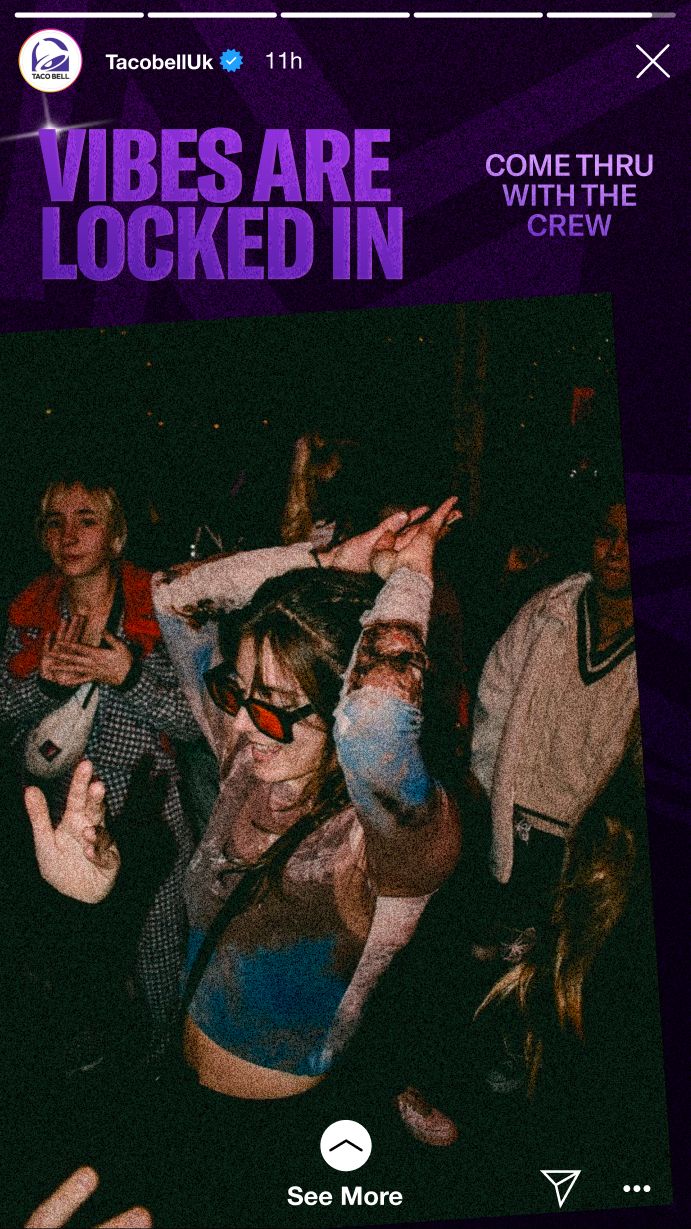
Design levers
Control and variable
The anchor holds: hero graphic, sparkle, grain and photography. The variables push: dark backgrounds, type layout and type colour.